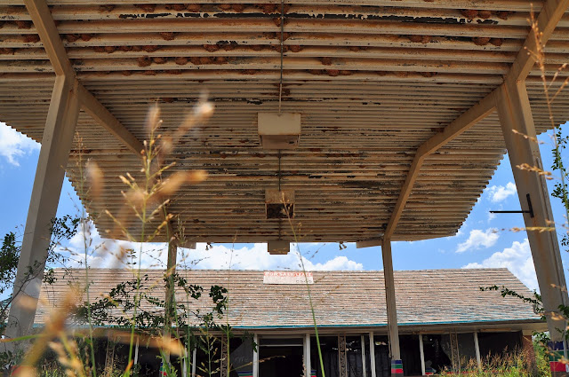
When I'm out with my camera, I always shoot in color. Sometimes, however, when I'm at my desk doing post processing, working on a selected shot's levels, saturation, etc. it just never seems to fall into place. Not that the shot itself was bad; if I was lucky I managed one with decent composition and exposure. But no matter how much tweaking with contrast, brightness, color warmth, etc., the photo just won't grab me.
Until I realize, by studying the shot more carefully, that color adds nothing to the photo. Typically I make this realization when I see the shot has a powerful shape to it, such as certain architecture may have. Yet if I were to leave it in color, the color itself appears to actually detract from the photo. Here's an example:
This is a shot of an abandoned Stuckey's roadside eatery and filling station along Interstate 20 in Texas, west of Fort Worth. It appears mostly as it would straight out of the camera, with a slight boost in color saturation in post processing. I like the angle and the light, but when I played with this file on the first run-through, no matter what I did with tweaking the color, I kept getting this nagging thought that color was doing nothing for the shot. When that happens I just convert it to black and white to see if I like that, most often I do. Here's the same shot black and white:
When I converted this to black and white and then tweaked with it in my software, it finally grabbed me. It's that "yes!" moment when you feel it in your gut that it finally works, that I wasn't on a wild goose chase after all.
Now some may say that the color shot of this scene works better for them. I would have no objection to that, but if I only get one chance to show you this photo, which way to go? I have to go with my gut, and it said "go black and white" in this instance.
Here's another example, at the same location:
This one is straight from the camera, no PP work at all. I like it, but what I was hoping to capture by stopping to photograph this rotting structure was the desolation of it; the sense of loneliness and faded glory from its heyday of a place of refreshment for road weary travelers and truckers. With the pretty blue skies and bright Texas summer sunshine, that seemed to diminish the desolation aspect. True, the contrast in that respect is interesting: pretty day surrounding a derelict structure. But not what I want. So I did this:
I not only did a black and white conversion, along with a color mask to give the shot somewhat of a sepia look to it, I also cropped it to pull the buildings up closer to the viewer's eye. This shot to me conveys more of what it's about; decay, abandonment, neglect, the brute force of nature undoing the careful manicuring efforts of humans when the building was occupied and useful. While the sky is still pretty, it's devoid of color, so it does not hit me right away as "oh, what a pretty sky!" It takes on a more austere tone, along with color being absent from the overgrowth of weeds and brush. Not to mention the buildings.
Still, you might say, "I like the color shots in both of these." That's certainly your right to feel that way, and I respect it. But I think an overall lesson here is that sometimes, when I'm making decisions what I hopefully wish to convey with a photograph of mine, that the ultimate outcome is met by the viewer with some aspect of common ground. In other words, if you see the black and white shots in these examples more effectively conveying the decay of the scene, I then think my choice to go black and white was justified.


The last black and white is the strongest. Mainly due to the contrast of the clouds. I like it alot. Hi Cameron, I saw the link to your blog on Facebook (via the hvac-talk members page). I'm hotntired on hvac-talk.
ReplyDeleteAlso a photography hobbyist. Using a D60, which has done well by me. Any-how...enjoyed seeing this and keep it up!
Pat Boykin, Panama City, FL
Pat, thanks for stopping by! Always nice to find another photog, especially one who is also an HVAC person. Also thanks for your comments; I agree about the second B&W shot. It is my favorite as well, and a lot of that is for the reasons you state.
ReplyDelete